


close
Choose Your Site
Global
Social Media
Views: 266 Author: HLun PACK Publish Time: 2026-08-20 Origin: Site


Content Menu
● What Is the Difference Between Matte and Glossy Stand Up Pouches?
● Matte vs Glossy Stand Up Pouch Comparison
● Matte Stand Up Pouch: Advantages and Limitations
>> Why Brands Choose Matte Pouches
>> Potential Matte Pouch Drawbacks
● Glossy Stand Up Pouch: Advantages and Limitations
>> Why Glossy Pouches Win Attention
>> Potential Glossy Pouch Drawbacks
● How to Choose the Right Pouch Finish
>> Choose a Matte Stand Up Pouch If You Want To:
>> Choose a Glossy Stand Up Pouch If You Want To:
>> Choose a Matte-and-Gloss Combination If You Want To:
● Finish Does Not Equal Barrier Protection
● Expert Checklist Before Production
● Matte vs Glossy Pouches for E-Commerce
● Create Your Custom Stand Up Pouch
>> 1. Is matte or glossy better for stand up pouches?
>> 2. Are matte stand up pouches more expensive?
>> 3. Does a matte finish reduce pouch barrier performance?
>> 4. Can I add a clear window to a matte pouch?
>> 5. Which pouch finish is better for coffee packaging?
>> 6. Which finish hides scratches and fingerprints better?
>> 7. Can I use matte and gloss on the same stand up pouch?
Choosing between a matte stand up pouch and a glossy stand up pouch is not simply a design decision. The finish influences shelf visibility, perceived product value, readability, scuff resistance, photography performance, and how customers experience your brand in their hands.
At HLun Pack, we see this choice during flexible-packaging projects for coffee, snacks, pet food, supplements, cosmetics, powders, and specialty consumer products. A matte finish can make a package feel refined and tactile, while a glossy finish can amplify color, contrast, and immediate shelf impact. The best choice depends on your product, sales channel, brand positioning, material structure, and packaging line requirements.
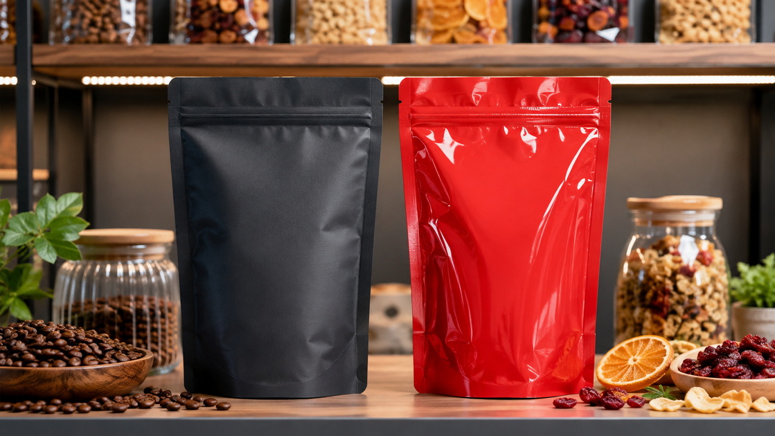
A stand up pouch is a flexible package with a bottom gusset that allows it to stand upright after filling. It may include a zipper, tear notch, hanging hole, degassing valve, spout, transparent window, or high-barrier film structure.
The difference between a matte and glossy pouch is primarily the outer visual finish.
- A matte stand up pouch diffuses light. Its surface looks soft, non-reflective, smooth, or lightly textured.
- A glossy stand up pouch reflects light. Its surface appears shiny, brighter, and more visually energetic.
- Both finishes can be applied to many pouch structures, including barrier laminates for dry food, coffee, powders, pet treats, supplements, and household products.
- Neither finish alone determines product protection. Barrier performance is determined mainly by the complete material structure, seal integrity, and product requirements.
In practical packaging development, the finish is typically specified as part of the outer printable web, coating, lamination, or varnish system. The correct combination must be confirmed with the packaging manufacturer before mass production.
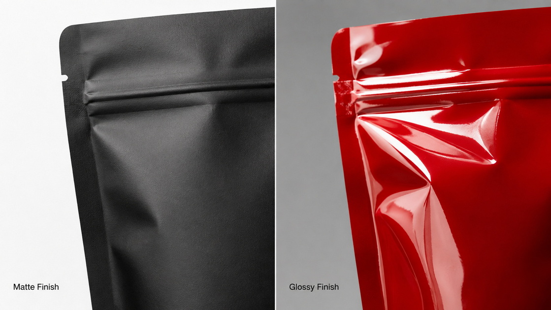
| Feature | Matte Stand Up Pouch | Glossy Stand Up Pouch |
|---|---|---|
| Visual effect | Soft, elegant, muted, non-reflective | Bright, reflective, high-shine |
| Brand positioning | Premium, organic, artisanal, minimalist | Bold, youthful, energetic, mainstream |
| Color appearance | More restrained and sophisticated | More saturated and high-contrast |
| Shelf readability | Usually strong under bright store lighting | May produce glare under direct lighting |
| Fingerprint visibility | Usually lower | Usually higher |
| Minor scuff visibility | Often hides small scuffs better | Scratches can be more visible because they disrupt the shine |
| Product window clarity | Can create a frosted appearance | Usually better for a clear viewing window |
| Tactile experience | Soft-touch or paper-like perception | Smooth, sleek, polished perception |
| Best-fit categories | Specialty coffee, tea, supplements, skincare, natural snacks | Candy, chips, colorful snacks, pet treats, promotional products |
| Design flexibility | Excellent for minimal graphics and spot-gloss accents | Excellent for photographic graphics and vivid colors |
Matte and gloss are not necessarily all-or-nothing choices. A matte pouch with spot gloss can create a premium base finish while highlighting a logo, product image, metallic detail, or key claim. This mixed-finish approach can make selected graphics more memorable and increase perceived quality.
A matte pouch often creates an immediate impression of care, quality, and restraint. It works particularly well when a product's value depends on craftsmanship, ingredients, sustainability communication, wellness, or premium positioning.
Key matte stand up pouch benefits include:
- Premium shelf presence. Matte packaging can make simple designs feel more deliberate and upscale.
- Reduced glare. Important product information, ingredient panels, and QR codes may be easier to view under bright retail lighting.
- Better everyday appearance. Matte surfaces often make fingerprints, dust, and minor handling marks less noticeable.
- Strong fit for minimalist branding. Neutral colors, botanical illustrations, subtle patterns, and understated typography work especially well.
- Effective tactile differentiation. A soft-touch matte finish can give customers a stronger sensory reason to pick up the package.
For products such as specialty coffee, tea, protein powder, nutraceuticals, dried fruit, or premium pet food, a matte finish often reinforces a message of intentional quality rather than mass-market volume.
Matte is not automatically the best finish for every product.
- Colors may look less vivid than they do on a glossy surface.
- Dark matte surfaces can still show oil staining or abrasion depending on the coating and handling environment.
- A fully matte transparent window may appear hazy or frosted.
- Fine details must be tested carefully because matte films can change how small typography and subtle gradients appear.
- Some matte laminations or coatings may affect cost, lead time, or processing requirements.
From a packaging-engineering perspective, do not choose matte solely from a digital mockup. Request a physical sample or production-level color proof. A screen cannot accurately show surface texture, gloss level, light reflection, or scuff behavior.
A glossy stand up pouch reflects light sharply, which can make color blocks, photographs, gradients, and metallic effects feel stronger. For brands competing on crowded retail shelves, this immediate visual energy can be valuable.
Key glossy stand up pouch benefits include:
- High color impact. Bright colors and high-contrast graphics generally appear more vivid.
- Strong performance for product images. Gloss supports photography, food imagery, fruit illustrations, and bold graphics.
- Clearer transparent windows. Where shoppers need to see the product, a glossy clear film usually provides a more transparent view than a matte-finished window.
- Easy-to-clean appearance. For some food and household-product applications, a smooth gloss surface can be easier to wipe.
- Familiar retail look. Gloss is widely used for snack foods, confectionery, pet products, and value-oriented consumer goods.
Glossy pouches work well when visual excitement is central to conversion. Think spicy snacks, candy, flavored nuts, colorful children's products, sports nutrition, seasonal gifts, or products with visually appealing ingredients.
The same reflectivity that makes glossy packaging attention-grabbing can create trade-offs.
- Bright lighting may create glare across product information.
- Fingerprints and smudges can be more visible.
- Small scratches may be easier to notice on a highly reflective surface.
- A shiny package can conflict with a calm, natural, handmade, or luxury-minimalist brand identity.
- Overly glossy packaging combined with too many colors or claims can look visually crowded.
The key is to match finish intensity with the product's buying context. A pouch that looks excellent in a studio photograph may perform differently under supermarket LEDs, warehouse lighting, or e-commerce delivery handling.
Use this practical decision framework before approving your packaging artwork.
- Position your product as premium, artisanal, sustainable, natural, or wellness-focused.
- Use a clean visual system with generous negative space.
- Reduce glare for detailed text-heavy packaging.
- Make minor fingerprints and handling marks less obvious.
- Create a soft-touch, high-end customer experience.
- Sell specialty coffee, tea, supplements, skincare, organic snacks, or premium pet products.
- Maximize color vibrancy and shelf visibility.
- Use food photography, bold illustrations, colorful gradients, or metallic graphics.
- Include a clear product window.
- Create an energetic, playful, youthful, or mainstream appearance.
- Package visually attractive products such as candies, snacks, pet treats, or dried fruit.
- Improve the visual impact of a promotional or seasonal product launch.
- Build a premium brand identity without sacrificing graphic emphasis.
- Use a matte background with a gloss logo, product name, pattern, or icon.
- Direct attention to a specific benefit, flavor, certification area, or product visual.
- Create depth and texture without adding excessive colors.
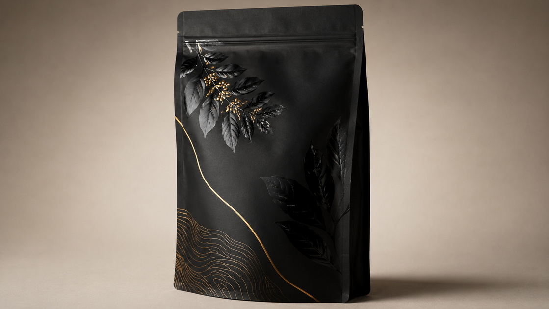
One of the most important purchasing mistakes is assuming that a matte pouch has lower barrier performance or that a glossy pouch is automatically more protective. In reality, finish and barrier are separate specifications.
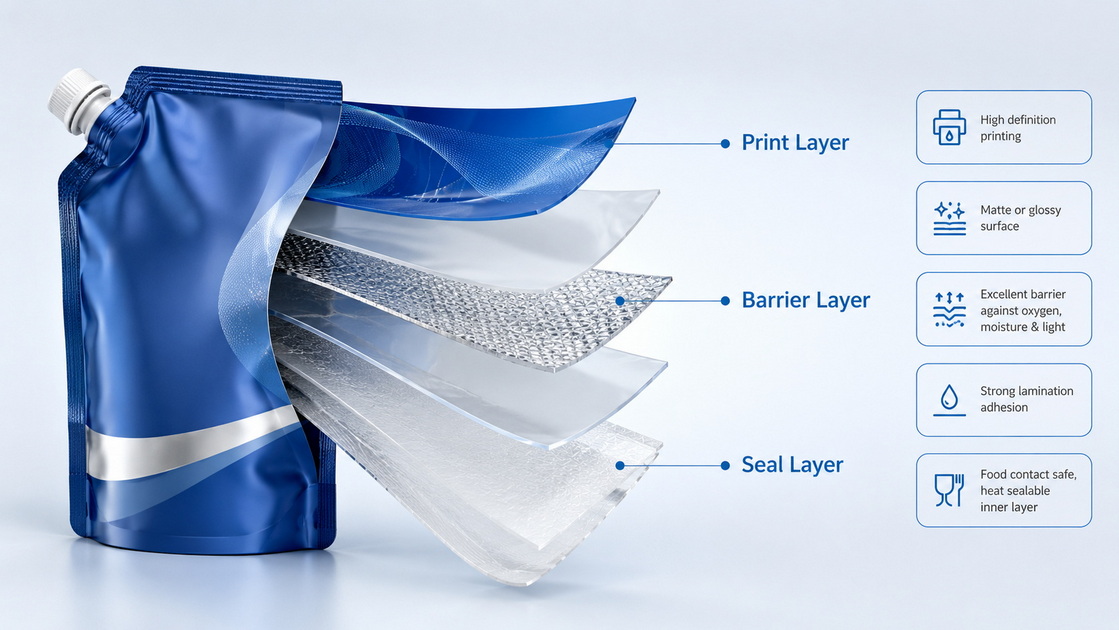
The pouch's ability to protect a product from oxygen, moisture, light, odor transfer, or aroma loss depends on the material structure. Depending on the product, this may involve PET, BOPP, PE, metallized films, aluminum foil, EVOH, or specialty high-barrier layers.
For example:
- Coffee may need aroma retention and a one-way degassing valve.
- Protein powder may require moisture protection and robust zipper performance.
- Oily snacks may need a structure designed for grease resistance and seal reliability.
- Light-sensitive supplements may need an opaque barrier layer rather than a clear pouch.
A matte exterior can be combined with a high-barrier laminate. A glossy exterior can also be paired with high-barrier materials. The correct choice should begin with your product's shelf-life target, filling process, storage environment, distribution method, and regulatory labeling needs—not solely with visual preference.
At HLun Pack, we recommend using a structured approval process for every custom stand up pouch project.
1. Define the product risk. Identify whether oxygen, moisture, light, aroma loss, puncture, or leakage is the primary concern.
2. Set the commercial objective. Is the product competing on premium positioning, price visibility, flavor excitement, product transparency, or e-commerce conversion?
3. Choose the pouch format. Confirm dimensions, bottom gusset, zipper, tear notch, hanging hole, valve, spout, and window requirements.
4. Select the finish. Compare matte, gloss, soft-touch matte, and matte-with-spot-gloss samples under retail-like lighting.
5. Prepare print-ready artwork. Use CMYK artwork, appropriate bleed and safe areas, high-resolution graphics, and clearly separated special-print layers such as white ink and varnish. Packaging artwork guidance commonly recommends 300 dpi at final size and print-ready vector PDF or AI files with outlined fonts.
6. Conduct a physical test. Review a real sample for color consistency, scuff resistance, zipper operation, seal strength, filling compatibility, and product appearance.
7. Approve the production standard. Confirm the approved material structure, Pantone references where required, finish, tolerances, and final artwork version in writing.
This process reduces the expensive gap between "looks good on screen" and "works reliably in the market."
E-commerce changes the decision because the pouch must work both in product photos and after shipping.
For online listings, glossy surfaces can produce attractive highlights but may also create uncontrolled reflections during photography. Matte surfaces are usually easier to photograph consistently because they reduce glare. However, glossy packaging may look more vivid in thumbnails when color is the main purchase trigger.
For direct-to-consumer brands, consider testing both a product-page image and a real unboxing sample. Your pouch should look attractive on screen, survive handling, and still communicate quality when a customer opens the delivery box.
The global stand-up pouch market was valued at USD 30.7 billion in 2023 and is projected to grow at an 8.0% CAGR through 2030, reflecting ongoing demand for lightweight, shelf-efficient flexible packaging formats. In a growing category, finish selection becomes a practical way to differentiate without redesigning your entire pouch format.
The right finish should support the complete packaging system: your product, barrier requirements, brand story, retail environment, and filling process.
HLun Pack can help you compare matte stand up pouches, glossy stand up pouches, and mixed-finish flexible packaging solutions based on your actual application. Share your product type, pouch size, estimated quantity, required features, and artwork concept to receive material and finishing recommendations tailored to your project.
Contact HLun Pack today to develop a custom flexible packaging solution that protects your product and strengthens your shelf presence.
Neither is universally better. Matte is usually best for premium, natural, minimalist, and tactile branding. Glossy is usually best for vivid colors, high-energy designs, clear windows, and strong visual shelf impact.
They can be, depending on the specific matte film, lamination, coating, print method, pouch size, order quantity, and whether spot gloss or soft-touch effects are added. Request quotes based on the exact material structure and finish rather than comparing only pouch dimensions.
Not by itself. Barrier protection comes mainly from the total laminate structure and sealing design. A matte outer layer can be combined with high-barrier materials suitable for many food, coffee, supplement, and powder applications.
Yes. Many brands use a matte pouch body with a glossy clear window. A fully matte finish over a window can create a frosted effect, while a glossy window offers better product visibility.
Matte is popular for specialty coffee because it supports premium branding and a tactile feel. However, either finish can work if the pouch includes the correct barrier structure and, where needed, a one-way degassing valve.
Matte generally hides fingerprints, minor abrasions, and light scuffs better. On glossy pouches, scratches and smudges may be more visible because they interrupt the reflective surface.
Yes. A matte base with selective gloss—often called spot gloss—can highlight logos, patterns, flavor names, or product claims. It is a strong option when you want both understated premium design and visual emphasis.
1. Grand View Research. "Stand-up Pouches Market Size, Share & Trends Analysis Report, 2030." Available at: [Grand View Research]. Market estimates cited: USD 30.7 billion in 2023; projected 8.0% CAGR from 2024 to 2030. [grandviewresearch]
2. CarePac. "Glossy Stand Up Barrier Pouches." Available at: [CarePac]. Reference for clear-window behavior, coating versus lamination, and combined matte/gloss finishing. [carepac]
3. C-P Flexible Packaging. "Matte and Gloss Pouches." Available at: [C-P Flexible Packaging]. Reference for consumer engagement and selective matte/gloss effects. [cpflexpack]
4. YLTPACK. "How to Design a Stand Up Pouch: The Complete Guide." Available at: [YLTPACK]. Reference for print-ready artwork guidance, CMYK, resolution, file preparation, and special layers. [yltpacking]
5. The Packaging Lab. "What Stand-Up Pouch Colors and Finishes Are Available?" Available at: [The Packaging Lab]. Reference for the visual characteristics of gloss and matte overlays. [thepkglab]
6. MTPak Coffee. "Matte vs. Glossy Finish Stand-Up Pouch Food Packaging Comparison." Available at: [MTPak]. Reference for practical handling considerations including fingerprints, scuffs, and finish selection. [mtpak]


