


close
Choose Your Site
Global
Social Media
Views: 266 Author: HLun PACK Publish Time: 2026-09-15 Origin: Site


Content Menu
● What Is Spot Color in Packaging Printing?
>> Common Types of Spot Colors
● What Is Process Color (CMYK)?
>> How CMYK Produces Full-Color Images
>> Best Uses for Process Color Packaging
● Spot Color vs. Process Color: Key Differences
● When Should You Choose Spot Color for Paper Packaging?
>> Choose Spot Color When Brand Color Is Non-Negotiable
>> Choose Spot Color for Large Solid Color Areas
>> Choose Spot Color for Special Effects
● When Should You Choose CMYK Process Printing?
>> Choose CMYK for Photography and Product Images
>> Choose CMYK for Complex Multi-SKU Packaging
>> Choose CMYK When Cost Must Support Full-Color Design
● The Hybrid Solution: CMYK Plus Spot Colors
>> Premium Cosmetic Folding Carton
● How Paperboard and Finishing Affect Color Results
>> Paper Substrate Changes Perceived Color
>> Lamination and Varnish Can Change Appearance
● Color Management: How to Avoid Packaging Print Surprises
>> 1. Define the Color Standard Early
>> 2. Build Artwork in the Correct Color Mode
>> 3. Request a Physical Proof for Color-Critical Packaging
>> 4. Approve the Production Standard
● Barcode Printing: Why Color Choice Is Also a Functional Decision
>> Practical Barcode Color Rules
● A Practical Decision Framework for Packaging Buyers
>> Choose Spot Color If You Need:
>> Choose CMYK Plus Spot Colors If You Need:
● Start With the Product, Not the Artwork
● Select Color Strategy Before Production Begins
>> 1. Is spot color better than CMYK for packaging?
>> 2. Can CMYK match Pantone colors exactly?
>> 3. Does every spot color increase packaging printing cost?
>> 4. Can I use CMYK and Pantone colors on the same box?
>> 5. Why does my printed box look different from my screen design?
>> 6. Should barcodes be printed in CMYK or spot color?
>> 7. Can spot color be used on kraft paper packaging?
Choosing between spot color and process color is one of the most important production decisions in custom paper packaging. It affects brand consistency, visual impact, barcode readability, production complexity, lead time, and total packaging cost.
For folding cartons, rigid boxes, corrugated mailers, paper bags, and other paper-based packaging, the best choice is rarely "spot color is better" or "CMYK is better." The right option depends on the artwork, brand requirements, print quantity, substrate, finishing process, and the level of color control your product needs.
At HLun Pack, we work with brands that need both packaging equipment and integrated paper-packaging solutions. From an operational perspective, color selection should happen early—before artwork approval, plate preparation, proofing, and mass production. A practical color strategy reduces rework, helps protect brand identity, and improves consistency across packaging runs.
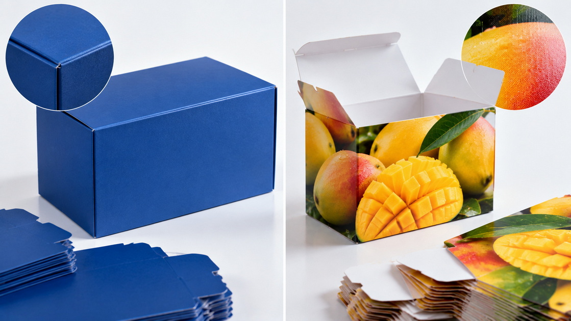
Spot color is a pre-mixed ink printed as one dedicated color, rather than being built from cyan, magenta, yellow, and black inks. In commercial packaging printing, spot colors are commonly specified through the Pantone Matching System (PMS), although printers may also use proprietary ink formulations or custom-mixed colors.
Each spot color normally requires its own printing plate or printing unit. For example, a package using one Pantone blue, one Pantone orange, and black text may require three ink colors or plates, depending on the press and print method.
The main advantage of spot color is predictability. Instead of recreating a brand color with different percentages of CMYK ink, the printer uses a specifically formulated ink intended to produce a defined target color.
Spot colors are particularly valuable when a packaging design depends on one or two recognizable brand colors.
Common examples include:
- A food brand with a signature red or orange
- A cosmetic box with a specific muted pastel tone
- A pharmaceutical carton with tightly controlled color coding
- A luxury rigid box using metallic gold or silver ink
- A retail package that needs a fluorescent or neon color
- A packaging design with a large solid-color background
- A barcode or functional marking that requires reliable contrast
Adobe explains that spot colors are premixed inks, often based on Pantone specifications, while process colors are created from combinations of standard CMYK inks. Each spot color requires a separate press plate, which is an important consideration for both cost and production planning.
| Spot color type | Typical packaging use | Key benefit |
|---|---|---|
| Pantone solid color | Brand logos, product lines, carton panels | Strong brand consistency |
| Metallic ink | Premium gift boxes, cosmetics, wine packaging | Decorative metallic effect without foil |
| Fluorescent ink | Promotional boxes, retail displays, seasonal campaigns | High shelf visibility |
| White ink | Kraft paper, dark paperboard, transparent materials | Improves contrast and opacity |
| Varnish as a spot plate | Spot UV, matte varnish, protective coating | Highlights selected visual areas |
| Custom-mixed ink | Brand-owned colors and special campaigns | Tailored color identity |
A spot color is not automatically more premium than CMYK. It becomes valuable when the packaging design genuinely needs a stable, vivid, special, or difficult-to-reproduce color.
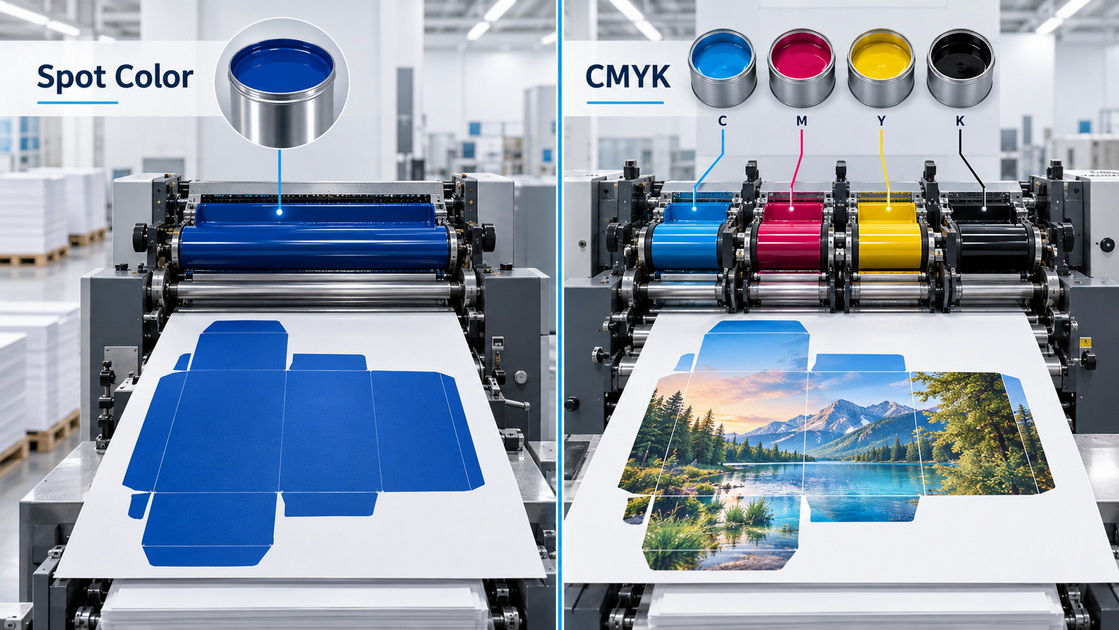
Process color, also called CMYK printing or four-color process printing, produces colors by layering four standard inks:
C = Cyan
M = Magenta
Y = Yellow
K = Key, usually black
Rather than printing a ready-mixed ink for every desired color, CMYK creates a wide range of colors through combinations of these four inks. The ink is printed in tiny dots called halftone dots. From normal viewing distance, the human eye blends the dots and sees a continuous image or color.
Adobe describes process colors as colors created through precise patterns of tiny CMYK halftone dots. This method is especially suitable for designs containing photographs, gradients, multiple shades, and high-color-count artwork.
CMYK is the standard option for photographic printing because a photo may contain thousands or millions of visible color variations. Printing every variation as an individual spot ink would be impractical and expensive.
For example, a snack box featuring a full-color product image may include:
- Golden brown product textures
- Green herbs or vegetables
- Red ingredients
- Soft shadows
- Bright highlights
- Complex color transitions
- Fine details in the background
CMYK allows these elements to be reproduced within one four-color printing process.
CMYK is usually the right choice when packaging artwork includes:
- Product photography
- Lifestyle imagery
- Large color gradients
- Multi-color illustrations
- Small-batch promotional packaging
- Seasonal designs with changing visuals
- Detailed e-commerce or retail packaging graphics
- Artwork containing many colors but no strict spot-color requirement
For many consumer packaging projects, CMYK delivers the best balance of design flexibility and production efficiency.
The most useful way to compare spot color and CMYK is to evaluate the decision from a packaging-production perspective rather than from a design-only perspective.
| Factor | Spot color | Process color (CMYK) |
|---|---|---|
| Ink method | Pre-mixed, dedicated ink | Cyan, magenta, yellow, and black inks combined |
| Printing plates | One plate or unit per spot color | Usually four plates or units for CMYK |
| Brand-color consistency | Usually stronger for a specific target color | Can vary due to substrate, press condition, and profiling |
| Best for | Logos, solid colors, metallics, special inks | Photos, gradients, detailed multi-color artwork |
| Color range | Limited to specified spot inks | Broad color range created from CMYK combinations |
| Special effects | Metallic, fluorescent, opaque white, varnish | Limited unless special inks are added |
| Cost efficiency | Often efficient for simple one- or two-color jobs | Often efficient for full-color and image-heavy designs |
| Large solid areas | Often cleaner and more uniform | May show variation or screening issues in some conditions |
| Proofing priority | Requires accurate ink and substrate confirmation | Requires color-managed proofing and CMYK conversion checks |
| Packaging application | Brand-led, premium, functional, color-sensitive | Visual storytelling, product imagery, multi-SKU graphics |
The core difference is straightforward:
- Choose spot color when exact color control or special visual effects matter most.
- Choose CMYK process color when the design requires photographic detail, gradients, or many colors.
- Choose a hybrid approach when you need both full-color artwork and exact brand color.
Spot color is usually the better choice when your packaging depends on a visually distinctive color that needs to remain stable across print runs, facilities, or product lines.
A signature brand color can become a major recognition asset. If customers identify your product by a particular red, blue, green, orange, or pastel tone, reproducing that color with CMYK alone may create unwanted variation.
This is especially important for:
- Premium consumer goods
- Cosmetics and skincare
- Supplements and healthcare packaging
- Alcohol and beverage cartons
- Boutique confectionery
- Luxury gift packaging
- Franchise and multi-market retail brands
For example, a high-end skincare brand may use a distinctive deep green across folding cartons, rigid boxes, display sleeves, and paper bags. If the green shifts toward blue in one batch and toward yellow in another, the packaging can look inconsistent even when the graphic design is unchanged.
A dedicated spot ink gives the production team a more stable target for color approval.
Large solid-color packaging panels are often more demanding than they appear. A dark navy box, a bright red carton, or a rich black rigid box can reveal streaking, uneven ink density, scuffing, and substrate variation more easily than a photo-based CMYK image.
A spot color can provide a cleaner, more uniform visual field for large color blocks, especially when the packaging includes premium coatings or lamination.
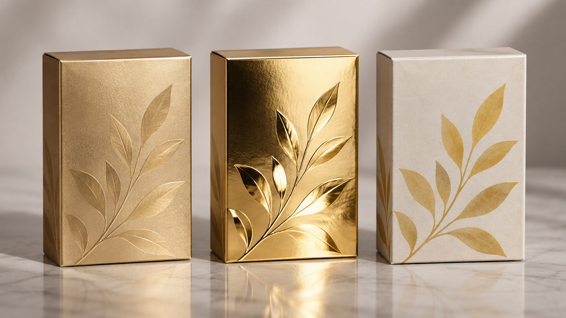
CMYK cannot replicate every visual effect. If your artwork includes metallic gold, metallic silver, fluorescent colors, opaque white, security colors, or certain branded hues, spot ink is typically required.
However, do not confuse metallic ink with hot stamping foil:
- Metallic ink creates a printed metallic appearance.
- Foil stamping applies metallic foil using heat and pressure.
- Metallic paper or film uses a reflective substrate.
Each option has different cost, durability, registration, and visual characteristics.
CMYK process printing is generally the most practical option for packaging that tells a visual story through photographs, illustrations, ingredients, lifestyle images, or multi-color graphics.
If your box includes a product photograph—such as food, cosmetics, electronics, toys, apparel, or consumer goods—CMYK is normally essential.
A full-color product photo uses a broad range of shades, highlights, shadows, and tonal transitions. Process printing can reproduce these variations through screened cyan, magenta, yellow, and black dots.
For example, a bakery packaging box may display:
- A golden croissant
- A dark chocolate drizzle
- Red strawberries
- Green mint leaves
- A soft cream-colored background
Reproducing this image with spot colors would require numerous inks and would still be less efficient than CMYK.
Many brands manage multiple product versions with changing flavors, colors, images, languages, and promotional claims. CMYK offers flexibility when each SKU needs a different visual identity.
This is common for:
- Food and beverage collections
- Subscription boxes
- Health and beauty products
- Promotional packaging
- E-commerce kits
- Retail-ready product cartons
- Limited-edition campaigns
When artwork changes frequently, a well-managed CMYK workflow can simplify creative production and reduce the need to manage many dedicated spot inks.
For a design containing many colors, CMYK is often more economical than using multiple spot inks. A six-color illustration, for instance, may require several dedicated spot colors if printed as spots—but only four process inks if reproduced in CMYK.
That said, the "cheapest" option is not always the best production option. The total packaging cost should also consider:
- Plate or cylinder requirements
- Press setup time
- Quantity
- Waste during color matching
- Finishing steps
- Substrate type
- Reprint risk
- Approval time
- Brand-color tolerance
A qualified packaging supplier should review these factors before recommending a print specification.
For many packaging projects, the best answer is not spot color or CMYK. It is CMYK plus one or more spot colors.
This approach is commonly used when a package needs:
- Full-color product photography
- A precisely controlled brand logo
- A metallic or fluorescent accent
- A spot UV varnish effect
- White underprint on colored or metallic paper
- A barcode or functional marking with high contrast
A cosmetic carton may use:
- CMYK for a product image and soft botanical illustration
- One Pantone spot color for the brand's signature lavender
- One metallic silver spot ink for decorative accents
- Spot UV varnish on the logo
- Matte lamination across the overall carton
This is not simply a design decision. It is a production-engineering decision involving ink sequence, trapping, registration tolerance, coating compatibility, curing, die-cutting, and quality inspection.
At HLun Pack, we recommend involving the packaging manufacturer or packaging equipment team before final artwork release. That allows the design team to protect the intended visual result while avoiding avoidable production issues.
A critical information gap in many discussions of spot color versus CMYK is that the same color does not look identical on every packaging material.
The visual result depends on more than the ink formula. It also depends on the substrate, surface treatment, press technology, coating, and finishing workflow.
The same Pantone or CMYK file can look different on:
- Coated art paper
- Uncoated paper
- Kraft paper
- White kraft paper
- Grayboard-mounted rigid box wrap
- Corrugated board
- Recycled paperboard
- Metallized paper
- Textured specialty paper
A bright color printed on coated white paper may look vivid and sharp. The same color printed on natural kraft paper may look warmer, darker, or less saturated because the brown substrate influences the final appearance.
Pantone publishes separate references for coated and uncoated stocks because paper surface and ink absorption affect color appearance. Packaging teams should therefore specify the intended substrate before approving colors.
Finishing affects how customers see color under retail lighting, sunlight, warehouse lighting, and online photography.
Common effects include:
- Gloss lamination can make colors look richer and deeper.
- Matte lamination can soften colors and create a premium tactile feel.
- Soft-touch lamination can reduce glare but may alter perceived darkness.
- Aqueous coating can protect the printed surface with a different visual effect.
- Spot UV can create contrast between glossy and matte areas.
- Foil stamping creates reflective highlights that shift with viewing angle.
For this reason, a digital artwork file should never be treated as the final color authority. The approved production proof, substrate sample, and press conditions matter more.
Color-management mistakes can create expensive delays. A design may look excellent on a monitor but print differently because screens use RGB light, while most commercial packaging print uses CMYK ink or spot inks.
A strong packaging color workflow should include the following steps.
Before artwork is finalized, identify:
- Brand Pantone numbers, if applicable
- CMYK conversion values
- RGB and HEX values for digital use only
- Approved paperboard or paper stock
- Required coating or lamination
- Acceptable color tolerance
- Whether a special ink is required
Do not assume that a HEX value is an adequate printing specification. HEX is designed for screen-based display, not for physical ink production.
Packaging artwork should be prepared according to the selected print method.
For a CMYK job:
- Use CMYK images and color builds.
- Check that RGB images are converted appropriately.
- Review rich black and small black text settings.
- Avoid unnecessary transparency and overprint conflicts.
For a spot-color job:
- Define spot swatches correctly in the design software.
- Use clear, consistent spot-color names.
- Confirm whether the ink should overprint or knock out.
- Ensure that special colors are not accidentally converted to CMYK during export.
Adobe notes that spot channels can be created and managed separately in graphics workflows, and preserving them requires appropriate file preparation and export procedures.
For color-sensitive packaging, a physical proof is more reliable than an on-screen review.
Depending on the project, this may include:
- Digital contract proof
- Press proof
- Drawdown sample
- White dummy with printed artwork
- Finished sample including lamination or foil
- First-article sample from mass production
A proof should be reviewed under standardized lighting whenever possible. Retail lighting, daylight, and warm indoor lighting can make colors appear different.
A good approval process documents:
- Approved sample date
- Paper or board specification
- Ink standard
- Finish and coating details
- Color target or reference
- Barcode verification result
- Tolerance expectations
- Authorized approver
This becomes the production reference for future orders and helps maintain consistency across repeat packaging runs.
Color is not only a branding issue. It can directly affect whether barcodes scan reliably.
GS1 recommends using dark bars on a light background, with black bars on white backgrounds as the best-known and most reliable combination. GS1 also advises avoiding red or reddish bars because many scanners use red light and may not detect red bars effectively.
For packaging teams, this means a barcode should not be treated as a decorative design element.
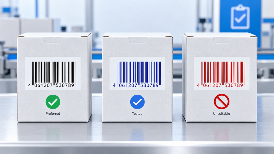
- Use black bars on a white background whenever possible.
- Use dark blue, dark green, or dark brown only after verification.
- Avoid red, orange, yellow, and light colors for barcode bars.
- Keep the barcode background light and free of graphics.
- Maintain a clear quiet zone around the symbol.
- Avoid gradients, photographic textures, and glossy reflective surfaces in the barcode area.
- Verify the final printed barcode, not only the digital artwork.
GS1's 2D barcode guidance states that low contrast, gradients, and reflective surfaces can reduce scan reliability. It recommends a minimum symbol contrast of 30% for a baseline quality grade and around 50% for greater reliability.
Use this checklist before choosing spot color, CMYK, or a hybrid print solution.
- Exact brand-color consistency
- Large solid-color backgrounds
- Metallic, fluorescent, white, or custom inks
- A simple design with one to three colors
- Strong visual consistency across product lines
- Better control of a signature logo color
- A premium or highly recognizable color identity
- Photography
- Complex illustrations
- Multi-color graphics
- Gradients and tonal transitions
- Frequent artwork changes
- Product-specific images
- High-color-count packaging designs
- Flexible creative production across multiple SKUs
- Product photography plus a precise logo color
- CMYK artwork plus metallic accents
- Full-color design plus spot UV
- CMYK graphics plus opaque white ink
- Retail packaging with special color requirements
- A balance of creative flexibility and brand control
The most effective packaging projects begin with the product's real-world requirements, not only with a beautiful graphic file.
Before selecting spot color or process color, packaging teams should ask:
1. Where will the package be sold: e-commerce, retail shelf, wholesale, export, or direct-to-consumer?
2. Is the package a one-time campaign or a repeatable long-term brand asset?
3. Does the product need photography, lifestyle visuals, or ingredient imagery?
4. Which colors are essential to brand recognition?
5. What paperboard, corrugated board, kraft stock, or specialty material will be used?
6. Does the package include metallic foil, lamination, embossing, spot UV, or other finishes?
7. Does it need barcodes, QR codes, regulatory text, or variable data?
8. What production quantity and budget range are planned?
9. What color variation is acceptable between future production batches?
10. Does the packaging need to be compatible with automated packing, labeling, sealing, or inspection equipment?
For paper packaging manufacturers and packaging-equipment providers, these questions help align the artwork with actual production capability. The goal is not only to print an attractive box. It is to create a package that can be manufactured efficiently, assembled reliably, protected during transport, scanned correctly, and recognized instantly by customers.
The best choice between spot color vs. process color depends on your packaging goals.
Use spot color when brand precision, solid-color performance, or special inks are essential. Use CMYK when your packaging needs photographs, complex illustrations, gradients, or many colors. Use a CMYK-plus-spot-color solution when your design needs both full-color visual storytelling and tightly controlled brand elements.
For paper packaging, the final result is influenced by more than artwork alone. Board type, coating, lamination, press setup, color management, proofing, finishing, barcode requirements, and production equipment all shape the outcome.
Need help selecting the right color process for your folding cartons, rigid boxes, corrugated packaging, paper bags, or integrated packaging line? Contact HLun Pack to review your artwork, substrate, finishing requirements, and packaging-production goals before mass production. Our team can help you develop a practical paper-packaging solution that balances shelf impact, print consistency, production efficiency, and total cost.
Spot color is not universally better. It is better for exact brand colors, solid-color areas, metallic or fluorescent effects, and certain color-critical applications. CMYK is usually better for photos, gradients, detailed illustrations, and artwork with many colors.
Not always. Many Pantone spot colors can be approximated in CMYK, but some colors—especially bright oranges, vivid greens, deep blues, metallics, fluorescents, and certain saturated tones—cannot be reproduced exactly with standard CMYK inks. The paper type and finishing process also affect the result.
A spot color can increase setup complexity because it generally requires an additional plate or printing unit. However, for simple one- or two-color packaging, spot-color printing can be more efficient than full CMYK. The cost depends on quantity, print method, number of colors, substrate, and finishing requirements.
Yes. This is a common hybrid packaging approach. For example, a box can use CMYK for product photography and a Pantone spot color for a logo, brand panel, metallic detail, or special effect.
Screens use RGB light, while packaging is typically printed with CMYK or spot inks. In addition, paperboard color, ink absorption, coating, lamination, press calibration, and lighting conditions all influence the physical result. A physical proof is the best way to approve color-critical packaging.
For maximum scanning reliability, barcode bars should be printed in a single dark ink color on a light background. GS1 recommends black bars on white backgrounds and advises against red or reddish bars because scanners often use red light.
Yes, but the final color will be influenced by the natural brown tone and absorbency of kraft paper. For bright or opaque results, a white underprint or a white-coated substrate may be needed. Always approve a physical sample on the actual material.
1. Adobe. "[Spot Color vs. Process Color]." Explains the fundamental differences between premixed spot inks and CMYK process printing, including common use cases for each method. [adobe]
2. Adobe. "[CMYK Process Colors in InDesign]." Provides technical guidance on CMYK process colors, halftone printing, and the distinction between process and spot-color workflows. [helpx.adobe]
3. Adobe. "[Print with Spot Colors from Photoshop]." Details the use of spot colors, spot channels, separate printing plates, and file preparation considerations. [helpx.adobe]
4. GS1. "[GS1 2D Barcode Colour and Quality Guide]." Provides guidance on barcode contrast, color selection, gradients, reflectance, quiet zones, and scan reliability. [ref.gs1]
5. GS1 US. "[Barcode Placement and Printing Guidelines]." Recommends dark barcode bars on light backgrounds, identifies black-on-white as the preferred combination, and warns against red barcode bars. [gs1us]
6. Pantone. "[New CMYK Guide Offers More Colors, New Unique Identification and Better Printing Consistency]." Discusses Pantone's CMYK color references and the relationship between spot-color and process-color systems. [pantone]


