


close
Choose Your Site
Global
Social Media
Views: 255 Author: HLun PACK Publish Time: 2026-11-19 Origin: Site


Content Menu
● What Does PMS Color Mean in Printing?
● How Does PMS Color Matching Work?
● PMS vs. CMYK vs. RGB: Which Should You Use?
>> When CMYK Is More Practical
● Pantone Coated vs. Uncoated: Why C and U Matter
>> What This Means for Paper Packaging
● Why the Same PMS Color Can Look Different on Packaging
>> Printing Process and Ink Transfer
● How to Specify PMS Colors for Paper Packaging: Six Steps
>> 1. Establish the Authoritative Reference
>> 2. Confirm the Material and Finish
>> 3. Agree on Spot or Process Reproduction
>> 4. Request an Appropriate Physical Sample
>> 5. Define Acceptance Conditions
>> 6. Retain the Approved Standard
● Measuring Packaging Color: What Delta E Can Tell You
● Matching a Carton and a Kraft Bag
● What PMS Color Requirements Mean for Packaging Machinery
● How to Find the PMS Color in Existing Artwork
● Plan Your Packaging Color with HLun Pack
● Frequently Asked Questions About PMS Color
>> Is PMS the same as Pantone?
>> Can a PMS color be converted to CMYK?
>> Will PMS colors look identical on every paper?
>> Is spot-color printing always more expensive?
>> Can digital printing reproduce a PMS color?
>> Is a PDF enough for final color approval?
PMS color is a standardized color reference from the Pantone Matching System that helps designers, brands, and printers communicate specific colors. In paper packaging, it gives everyone a shared starting point for reproducing logos, backgrounds, and other brand-critical elements.
However, a Pantone number alone cannot guarantee identical results on every box or bag. Paper, ink, printing conditions, and finishing all influence the final appearance.
At HLun Pack, our focus on paper packaging, packaging machinery, and integrated packaging solutions shapes a practical approach: define the color target alongside the material and production requirements, not separately.
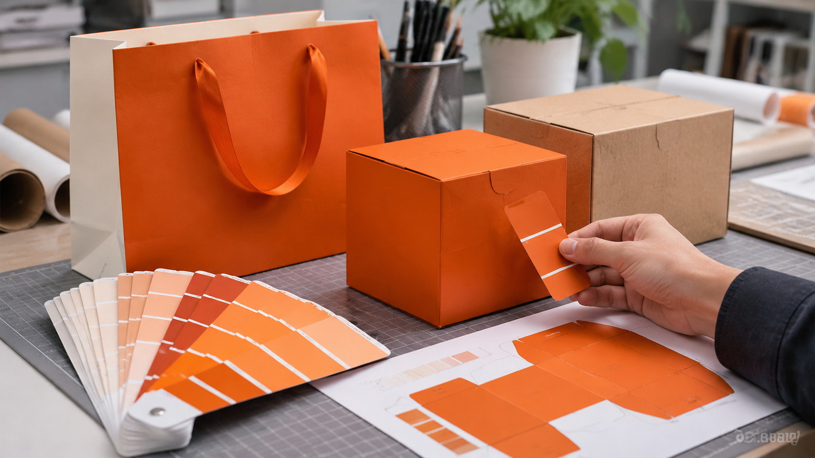
The Pantone Matching System provides named and numbered color references that simplify communication between designers, ink suppliers, printers, and buyers.
Instead of requesting "a warmer red," a brand can specify a particular Pantone reference and the relevant guide.
In conventional spot-color printing, an ink supplier or printer formulates a dedicated ink to match the target. That ink is printed as a separate color rather than simulated entirely through cyan, magenta, yellow, and black.
The distinction matters: a file containing a Pantone swatch does not necessarily mean the production equipment will print a dedicated spot ink. The printer may reproduce it through process inks instead.
Confirm the intended production method before approving artwork.
A reliable workflow connects three elements:
- A defined color reference.
- An ink formulation suited to the printing process.
- An approved result on the intended packaging material.
The printer uses the reference to establish a target, prepares the ink, and evaluates a sample. Adjustments may be necessary because the production paper differs from the paper used in the reference guide.
Think of PMS as a shared language, not an automatic guarantee.
For packaging buyers, the key question is not simply, "Can you print this Pantone color?" It is, "How will you reproduce and verify this color on our chosen material?"
Each system serves a different purpose. Packaging projects often need all three, but they should not be treated as interchangeable.
| System | How it works | Typical application | Main consideration |
|---|---|---|---|
| PMS spot color | Uses a separately formulated ink | Brand logos and selected solid areas | Requires compatible production capability |
| CMYK | Builds colors using four process inks | Photographs and multicolor artwork | Some spot colors cannot be closely reproduced |
| RGB | Combines red, green, and blue light | Websites and screen previews | Screen appearance is not a physical print standard |
Consider a dedicated spot color when a specific brand shade is especially important, or when large areas of a design use one consistent color.
It can also suit simple artwork with only a few colors.
CMYK is usually the natural starting point for photographs, complex illustrations, and designs containing many colors.
A hybrid approach is also possible: print images in CMYK and reserve a spot ink for a critical logo.
Compare the complete job specification rather than assuming one method is always cheaper or more accurate.
A Pantone reference may end in C or U. These letters identify the reference paper surface:
- C indicates coated paper.
- U indicates uncoated paper.
Coated paper tends to keep more ink near its surface. Uncoated paper absorbs ink differently and can produce a softer appearance.
The same ink formulation can therefore look different on the two papers.
Importantly, the C suffix does not mean that the finished package must receive gloss lamination. It describes the reference stock, not a mandatory finishing treatment.
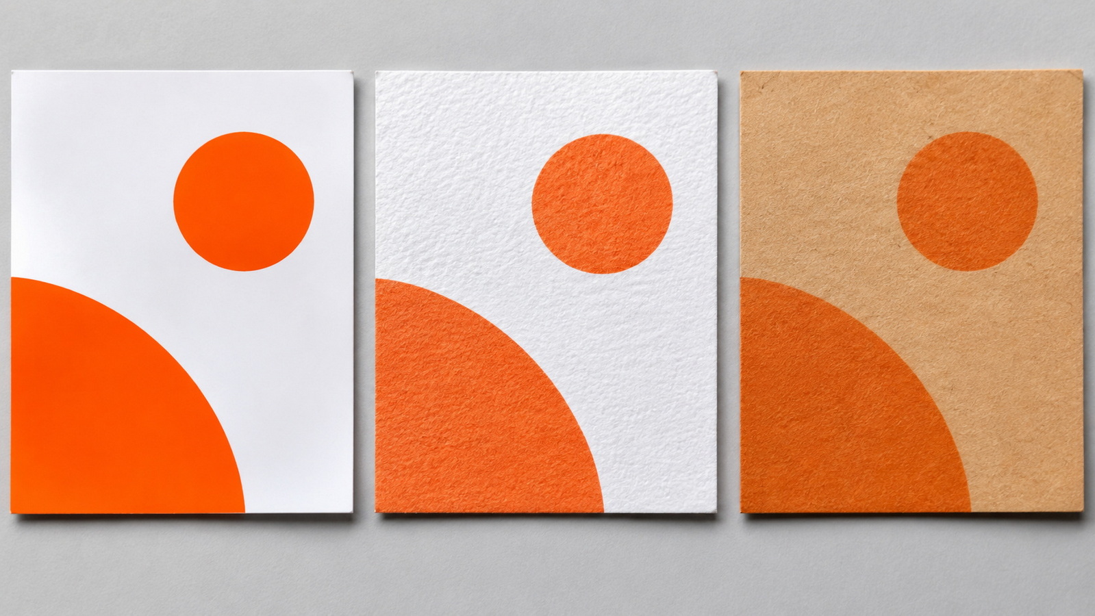
A coated folding carton and an uncoated paper bag may require different production targets to achieve an acceptable visual relationship.
For brown kraft packaging, the paper's own color becomes especially important. Do not assume that a reference printed on white paper will transfer unchanged.
Approve the actual substrate early, before committing to the final appearance.
Color variation usually reflects several interacting production conditions, not simply an incorrect ink recipe.
White, cream, recycled, and brown papers provide different backgrounds. Their surface properties also change how ink sits and spreads.
For repeat orders, specify the paper grade and retain an approved material sample.
Offset and flexographic printing use different ink-transfer mechanisms. Ink formulation and application must suit the process.
In flexographic work, anilox selection and ink condition can influence the deposited ink film. A successful match must be repeatable under normal operating conditions.
Varnish and lamination can change gloss and perceived color. A sheet approved before finishing may not represent the appearance of the completed package.
Where appearance is critical, review a finished sample.
A phone image is useful for discussing layout, but it is a weak basis for final color approval.
Evaluate physical samples under agreed lighting. Otherwise, different viewing environments can create disagreement even when everyone is looking at the same printed piece.
Start with the brand guidelines or original artwork.
Record the complete Pantone designation, including its suffix. If an existing package is the reference, confirm whether it is an approved master or merely a previous production sample.
Document the paper grade, surface, color, and intended coating or lamination.
Avoid approving color on a substitute white stock if production will use brown kraft.
Ask whether the target will use a dedicated ink, CMYK simulation, or another supported printing configuration.
Pantone Color Bridge can help show the difference between a spot reference and its closest published process-color simulation. It is a comparison tool, not proof that both will look identical.
An ink drawdown helps assess ink on the proposed substrate. A production-representative trial provides additional information about press behavior and finishing.
Ask what each sample demonstrates and what it cannot demonstrate.
Agree on the visual reference and any instrumental tolerance before the full run.
Record who has approval authority and what happens if the result falls outside the agreed limit.
Keep a signed sample with the job specification.
For repeat production, identify the approved artwork version, paper, ink reference, and finish. Reassess the target when a significant material or process change occurs.
Delta E expresses the measured difference between two colors. It helps turn subjective descriptions such as "too dark" into a more structured discussion.
However, a tolerance is incomplete unless the measurement method is defined.

A useful specification records:
- The reference sample or digital target.
- The color-difference formula, such as ΔE00.
- The acceptable limit agreed for the project.
- Instrument settings and measurement conditions.
- Sample backing and measurement location.
There is no single tolerance that automatically suits every packaging project. Establish a realistic requirement through sampling and discussion with the printer.
For papers containing optical brighteners, measurement conditions are particularly important. M1 conditions are relevant to standardized UV handling in modern graphic-arts workflows.
Instrument readings should support visual assessment, not eliminate it. Surface texture and gloss still affect how customers experience the package.
Consider a brand launching a coated white carton and a natural kraft shopping bag with the same orange logo.
The design file specifies one Pantone reference. Yet the orange appears brighter on the carton and more muted on the bag.
This is an illustrative scenario, not an HLun Pack customer case.
A practical response would be to:
1. Review both materials together.
2. Produce ink samples on each substrate.
3. Determine whether a close match is technically achievable.
4. Evaluate options such as a different paper or compatible opaque underprint.
5. Approve separate production standards where necessary.
The objective is a controlled brand appearance across the packaging family, not an unsupported promise that one ink recipe will look identical everywhere.
Color requirements should inform equipment discussions before a production line is selected.
For an integrated packaging project, establish where printing happens: on the proposed machine, on a separate press, or through an external print supplier.
Not every paper packaging machine includes a printing unit.
For equipment that does print, discuss:
- Available printing stations.
- Support for dedicated spot inks.
- Ink and substrate compatibility.
- Drying requirements.
- Registration control.
- Cleaning and color-change procedures.
- Access for sampling and inspection.
Request a trial using representative paper and artwork when feasible.
A machinery specification should describe the production conditions needed to maintain the approved result, not merely list a nominal number of colors.
Begin with the original brand specification. It is more authoritative than a color guessed from a screenshot.
If a vector file contains spot-color swatches, inspect their names and separation settings. A document may preserve Pantone references, but verify that the intended colors remain spot colors in the production output.
If you only have a HEX value, photograph, or flattened image, treat automated matching as an approximation.
Choose candidate references, compare physical samples, and obtain approval.
Also check your software's available libraries. Older tutorials may show built-in Pantone menus that no longer match current installations; Pantone Connect provides access to current libraries within supported workflows.
Reliable packaging color starts with a complete production brief.
Share your artwork, Pantone references, paper preferences, package dimensions, finish, and expected order volume with HLun Pack. Also indicate whether you need finished packaging, packaging equipment, or an integrated solution.
These details provide a practical starting point for discussing materials, production requirements, and the samples needed before approval.
PMS means Pantone Matching System. Pantone also offers other color systems, so specify the relevant library rather than using "Pantone" alone.
Yes, but the result is a simulation. Some colors fall outside the achievable range of a particular CMYK printing condition.
No. Paper shade, absorbency, surface, and finishing influence appearance. Approve a sample on the intended stock.
No. Costs depend on the design, number of inks, setup, run length, and equipment. Compare job-specific quotations.
It may simulate it within the device's capabilities. A Pantone reference does not automatically mean the digital press uses a dedicated matching ink.
Usually not for color-critical packaging. A PDF communicates artwork, but physical sampling is needed to assess ink, paper, and finish together.
1. [OXO Packaging — "What is PMS Color, And How to Use It in Printing?"]
Original article reviewed for topic coverage, structure, and areas requiring clarification. It is not used as evidence of HLun Pack's capabilities or customer experience. [oxopackaging]
2. [Pantone — Help Center: Graphics]
Technical basis for spot versus process color, coated and uncoated references, and appearance differences caused by paper despite identical ink formulations. [pantone]
3. [Pantone — Color Systems for Graphic Design]
Background on graphic-arts color systems, spot inks, process inks, and C/U designations. [pantone]
4. [Pantone — Color Bridge Guide Set: Coated & Uncoated]
Basis for explaining side-by-side comparisons between Pantone spot colors and their closest published CMYK simulations. [pantone]
5. [Pantone — Pantone Connect X Adobe FAQ]
Source for changes to preloaded software libraries and access to current Pantone libraries through Pantone Connect. [pantone]
6. [X-Rite — Choosing the Right Instrument for Accurate Color Assessment]
Technical support for spectrophotometric assessment, color differences, substrate evaluation, and M1 measurement conditions. [xrite]
7. [X-Rite — ColorCert Suite 3.5 User Manual]
Technical basis for specifying measurement conditions, backing materials, substrate measurements, and configurable acceptance tolerances. [xrite]


