


close
Choose Your Site
Global
Social Media
Views: 222 Author: HLun PACK Publish Time: 2026-05-23 Origin: Site


When you move from a glowing screen to real‑world paper packaging, color behaves very differently – and misunderstanding CMYK, RGB, and Pantone is one of the fastest ways to ruin an otherwise great packaging design. As a paper packaging machinery manufacturer working daily with converters, printers, and brand owners, I've seen how the right color system can protect your brand, cut waste, and keep your packaging lines running smoothly. [magetop]
In this guide, I'll walk you through CMYK, RGB, and Pantone (PMS) from a practical, production‑floor point of view, so your next packaging project prints exactly the way you imagined it.
- Choose the right color system for each packaging project
- Avoid costly color surprises between design files and printed boxes
- Talk confidently with printers and packaging suppliers
- Set up your artwork correctly in Adobe Illustrator and Photoshop
- Decide when Pantone is worth the extra cost for your brand
In digital design, you can often "fix it later." On a packaging line, that flexibility disappears. Once plates are made and your corrugated or folding carton run is on press, color errors turn into real money: scrapped sheets, reprints, delayed launches, and sometimes damaged brand trust. [magetop]
From an OEM's perspective, we see three recurring problems when brands don't understand color systems:
- The design team builds artwork in RGB, then wonders why printed colors look flat or dirty in CMYK.
- The brand expects "Tiffany blue" consistency from vendors all over the world but doesn't specify a Pantone reference.
- Packaging engineers focus on board grade and structural integrity, but no one takes ownership of color standards and communication across the supply chain. [iodigital]
Understanding the basics of process color (CMYK), spot color (Pantone/PMS) and screen color (RGB) is the fastest way to fix all three.
Before we look at RGB, CMYK, and Pantone separately, you need one core distinction: process color vs spot color.
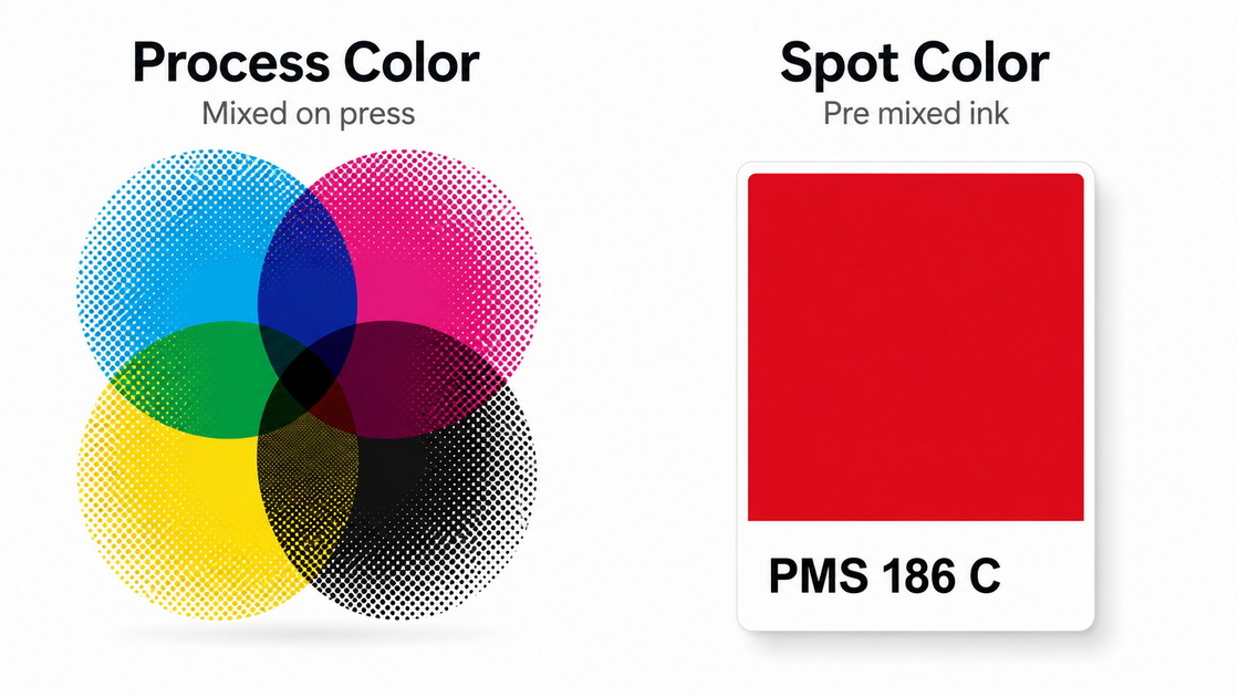
Process colors are created on press by mixing a fixed set of inks during printing, typically four: Cyan, Magenta, Yellow, and Key (Black) – the CMYK system.
- Only four inks are loaded
- Dot patterns of each color overlap to create thousands of hues
- Widely used for folding cartons, mailer boxes, labels, inserts, and most printed packaging
Process printing is cost‑effective, flexible, and ideal when you have many colors, gradients, or photographic images on your package.
Spot colors are premixed inks with a specific formula.
- Each color is mixed before going on press
- Typically requires a separate plate and unit for each spot color
- Enables special colors (neons, metallics) and ultra‑consistent brand hues
Pantone is the dominant spot color system in packaging. It gives you a standardized code (for example, Pantone 2268 C) that printers around the world can match, helping you keep the same brand color on every box, mailer, or sleeve.
RGB stands for Red, Green, Blue. It is an additive color system used for digital screens.
- Colors are made with light, not ink
- Adding more color light makes the image brighter
- When red, green, and blue are all at maximum intensity, you see white
Designers love RGB because what they see on their screen looks vibrant and intense. That's perfect for websites, e‑commerce, and product renderings displayed on phones or laptops.
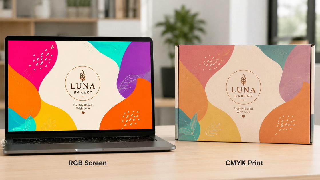
Here's the critical point: RGB is not used for packaging production.
Packaging is printed with ink on paperboard or corrugated, not with light on backlit screens. If you send RGB files to your printer, they must convert them to CMYK, and that conversion:
- Reduces the color gamut (some bright RGB colors simply can't be reproduced in CMYK)
- Can make neon‑like colors appear dull or muddy
- Introduces color shifts that are hard to predict without careful proofing
Best practice from a packaging machinery viewpoint: always set your packaging dielines and print files in CMYK from the start, and reserve RGB for digital mockups, web images, and 3D previews.
CMYK stands for Cyan, Magenta, Yellow, and Key (Black). It is a subtractive color system: you start with white (paper) and subtract light by layering inks.
- Adding more ink makes the color darker
- Combinations of C, M, Y create a wide range of hues
- Black ("K") adds depth, contrast, and clean text
For example, a medium green for a packaging logo might be created with approximately 55% cyan, 34% yellow, and 14% black in CMYK.
In our daily work with paper packaging clients, CMYK is our default recommendation because:
- It is cost‑efficient – you only use four inks, even for complex graphics.
- It is ideal for short and medium runs on folding carton and corrugated lines.
- It handles photography, gradients, and shading much better than spot colors alone.
If your budget is tight, and you're okay with a small amount of variation between print runs and materials, CMYK is usually the best balance of quality and cost.
CMYK is powerful, but not perfect:
- Some saturated blues, oranges, or neons in RGB cannot be matched exactly in CMYK.
- Colors can differ slightly between presses, substrates, and print locations.
- On uncoated or kraft paper, inks sink in and appear more muted.
This is where Pantone spot colors come in – especially for mission‑critical brand elements.
PMS stands for Pantone Matching System, a global standard of pre‑mixed spot color inks.
- Every Pantone color has a unique code
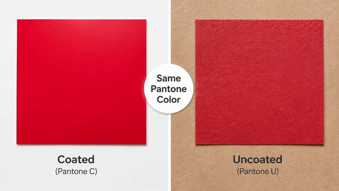
- Suffix "C" indicates coated paper; "U" indicates uncoated paper
- Coated stocks give sharper, glossier colors; uncoated gives a rustic, absorbent look
Well‑known brand colors like Coca‑Cola red or Tiffany blue rely on Pantone to look identical worldwide, no matter which plant or printer is used.
Pantone is typically recommended when:
- Printing logos and core brand elements that must match exactly on every packaging SKU
- Working with neon, metallic, or highly saturated colors that CMYK cannot reproduce
- You produce packaging in multiple regions and need a shared global color reference
However, Pantone inks are more expensive than using CMYK alone, because each spot color requires its own ink set and printing unit.
In paper packaging, this choice is not theoretical – it's tied directly to your substrate:
- Pantone C (coated) is typically used on SBS board, coated folding cartons, and premium rigid boxes where a smooth, glossy finish is desired.
- Pantone U (uncoated) is usually used for kraft mailer boxes and uncoated, more natural‑looking substrates.
If you choose kraft paper for sustainability or brand aesthetic, expect colors to look softer, with lower contrast. Specifying Pantone U can help you manage that expectation and maintain consistency.
From both a brand and factory perspective, the decision between CMYK and Pantone comes down to three factors: budget, brand consistency, and visual complexity.
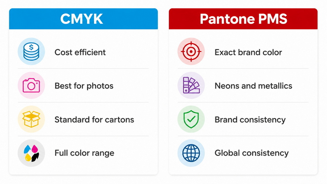
Use CMYK when:
- You have many colors, photos, or gradients on your packaging
- You're price‑sensitive and need economical printing
- Minor variation between print runs is acceptable
Use Pantone (alone or in combination with CMYK) when:
- Your logo colors are non‑negotiable brand assets
- You print in multiple locations or on multiple substrate types
- You need special inks like metallic or neon
In real packaging operations, a common setup is CMYK + 1 or 2 Pantone spot colors:
- CMYK handles background images, textures, and photography.
- Pantone inks handle the logo, key brand panels, or compliance marks that must be precise.
This hybrid approach keeps costs under control while protecting your most visible brand colors on every box that leaves the line.
Color decisions are useless if your design files are built in the wrong mode. Here's how to work in CMYK from the start and avoid last‑minute conversion surprises.
To design in CMYK in Illustrator:
1. Open Adobe Illustrator.
2. Go to File → Document Color Mode → CMYK Color.
3. Confirm that new color swatches default to CMYK values.
To convert an existing RGB design to CMYK:
1. Open your file in Illustrator.
2. Go to Edit → Edit Colors → Convert to CMYK.
3. Review all key colors after conversion and adjust manually where needed.
To design or convert in CMYK in Photoshop:
1. Open Adobe Photoshop.
2. Go to Image → Mode → CMYK Color to work directly in CMYK.
3. To convert from RGB, go to Edit → Convert to Profile and choose a CMYK profile under "Destination Space."
After conversion, compare key brand areas to a Pantone book or printed proof, especially if you're matching an existing color standard.
Drawing on both design and machinery commissioning projects, here are the issues we see most often – and how to avoid them.
Designers sometimes build packaging in RGB because it looks vibrant on their monitor, then are shocked when the printed version looks dull.
Fix: Start every print‑ready dieline and artwork file in CMYK mode. If you must design in RGB for a digital mockup, convert to CMYK early and adjust colors before final approval. [precisecreative]
Brands often share only a logo file, not the Pantone codes behind it. Each vendor then "eyeballs" a match, and color consistency is lost across different plants and materials.
Fix: Define a small, clear color standard:
- One or two Pantone references for your primary brand colors
- CMYK fallback values for cases where Pantone is not available
Share these in your brand guidelines and on every packaging artwork brief.
The same CMYK build looks different on coated white board vs brown kraft. Color feedback frequently arrives only after first production, when change is expensive.
Fix: Always request:
- Printed proofs on the actual substrate (coated or uncoated)
- A clear note from your printer on whether they used Pantone C or U references
This avoids surprises when your first pallet of boxes comes off the line.
To add more real‑world value, here is a simple, step‑by‑step color workflow you can integrate into your packaging development process.
- Confirm brand Pantone codes (C and U where relevant).
- Define CMYK equivalents and document them in brand guidelines.
- Involve your packaging supplier or machine OEM early when selecting substrates and finishes. [iodigital]
- Set dieline templates to CMYK by default (Illustrator or Photoshop).
- Use Pantone spot swatches only for logo and critical brand colors.
- Keep support graphics, photos, and background in CMYK.
- Ask for ink drawdowns or printed proofs on the exact board or kraft you'll use.
- Compare to Pantone books under consistent lighting.
- Approve colors before plates or cylinders are made.
- Save signed color proofs and Pantone references as part of the specification package for each SKU.
- When moving to a new plant or country, share the same reference set to protect brand consistency.
This simple workflow dramatically reduces color‑related delays and reprints on paper packaging lines.
To enhance user experience and time on page, I recommend inserting visuals in these locations:
- After the Process vs Spot Color section: a simple diagram contrasting process (CMYK dots overlay) vs spot (single solid ink area).
- Next to the RGB explanation: a side‑by‑side comparison of the same design in RGB on screen vs CMYK in print.
- In the CMYK vs Pantone decision section: a comparison table screenshot or infographic.
- In the Adobe setup section: annotated screenshots of Illustrator and Photoshop menus showing CMYK settings.
These visuals help non‑technical readers quickly understand concepts that are difficult to grasp from text alone. [infomedia]
You can include a table like this directly in your blog:
| Color system | Best use in packaging | Advantages | Limitations |
|---|---|---|---|
| RGB | Digital mockups, online previews | Very bright on screens; ideal for e‑commerce visuals | Not used for physical printing; must be converted to CMYK, causing color shifts |
| CMYK | Most folding cartons, corrugated boxes, labels | Cost‑efficient; handles photos and gradients well; standard for package printing | Limited gamut vs RGB; slight variation across presses and substrates |
| Pantone (PMS) | Logos, brand panels, special colors | Exceptional consistency; supports neons and metallics; global color standard | Higher cost; extra plates/units; not ideal for complex images alone |
If you're planning a new packaging line or refreshing your brand's paper packaging, involve your equipment and packaging partners early in the color discussion.
At HLun Pack, we can:
- Review your existing artwork and substrates for color risk points
- Recommend print‑friendly settings and Pantone/CMYK strategies for your packaging runs
- Coordinate with your printers to ensure colors are compatible with their presses and your chosen materials
Call to action: If you're considering a packaging upgrade or a new product launch, reach out to our team with your current dielines and color standards. We'll help you build a color workflow that keeps your packaging line efficient and your brand colors consistent from design to delivery.
Q1. Why do my printed boxes look darker than the colors on my screen?
Because screens use RGB light and print uses CMYK ink, the color gamut and brightness are different. When RGB artwork is converted to CMYK, some bright hues inevitably become darker or less saturated.
Q2. Can I print my packaging using only RGB files?
No. RGB is a screen‑based color system, so printers must convert RGB files to CMYK or spot colors before production. This conversion can introduce color shifts, so it's better to design directly in CMYK for packaging.
Q3. Is Pantone always better than CMYK for packaging?
Not always. Pantone offers better consistency for key brand colors and special inks, but it is more expensive and less flexible for complex images. For most packaging, CMYK or CMYK plus one or two Pantone spot colors is the most efficient choice.
Q4. How many Pantone colors should I use on my box?
From a cost and production standpoint, use as few Pantone colors as possible – often one or two for logos and critical elements, with the rest of the design handled in CMYK. Each added spot color increases complexity and cost.
Q5. Does coated vs uncoated board really change how colors look?
Yes. Coated stocks keep ink on the surface, producing sharper and more vibrant colors, while uncoated and kraft stocks absorb more ink and appear softer and more muted. Pantone C and Pantone U references exist precisely to account for this difference.
1. PackMojo – "How Do You Make Use Of CMYK In Packaging Design?" (CMYK, RGB, PMS definitions, process vs spot color, Adobe setup examples) – [https://packmojo.com/blog/cmyk-rgb-pms-everything-you-need-to-know/]
2. TopRank Marketing – "E-E-A-T and SEO: Optimizing for Google's Guidelines" (experience, expertise, authoritativeness, trust signals) – [https://www.toprankmarketing.com/blog/eeat-seo-google-guidelines-experience-expertise-authority-trust/] [toprankmarketing]
3. iO Digital – "Google E-E-A-T: Creating Content That Puts People First" (importance of accurate, up‑to‑date, actionable content and explicit references) – [https://www.iodigital.com/en/insights/blogs/google-e-e-a-t-creating-content-that-puts-people-first] [iodigital]
4. Precise Creative – "How to Write, Optimize Blogs for Search Engines" (keyword placement in title, first paragraph, headings, CTAs, and alt tags) – [https://precisecreative.marketing/how-to-optimize-blog-articles-for-search-engines/] [precisecreative]
5. Backlinko – "Blog SEO: The Complete Guide" (single primary keyword focus, H‑tag optimization, meta description best practices) – [https://backlinko.com/hub/content/blog-seo] [backlinko]
6. Infomedia – "Rank Better with EEAT: Unique Content Is Key to Blogging" (scannable content, bullets, visuals, and internal linking for UX) – [https://infomedia.com/blog/eeat-unique-blog-content/] [infomedia]


